Over two weeks in Germany I saw countless historical markers, commemorating important events or pointing out places of interest. But, about halfway through my trip I started to notice that many of the signage looked more like museum interpretative panels than the typical historical markers we are used to seeing in the United States.
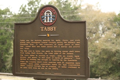
Here’s a typical historical marker that can be found in the United States.
And here are some examples of makers I saw around Germany.


Sorry to say, but the German historical interpretation signage is more engaging than what I typically see in the United States.
They are more informative and provide better insight into the story of the object, building, or location it is describing. Each one is accessible to a variety of audiences, not just a fluent reader. They invite the viewer to connect with the content because they are full of images and color and images.
I also noticed that many of them had more than one access point to appeal to a variety of audiences. For example, a small piece of text, a photo or picture, or a longer description. This means that someone just grazing has enough to satisfy their curiosity. But, there’s more information for someone who wants to learn more.
I also found the panels to be perfectly placed in areas where a person may be waiting for a bus or riding on the subway or have time to stop and read during a leisurely walk.
I do love that the United States has made it a priority to place historical markers at places of note. But, I wish they were a little more accessible. Larger print. Photos or images. A timeline here or there or a visual text of some sort. We aren’t all reading at a eighth grade reading level.
I think about my twelve-year-old walking up to that historical maker I pictured from Georgia on tabby and then I think about him sitting on the subway in Germany learning from those panels. I would wager to say the panels on the subway would draw his attention far more than the bland panel on tabby. But, the content of both is important. They both hold information he should know.
So, maybe it’s time for a redesign of U.S. historical markers? Could we make them a little more enticing for Americans to access information?
